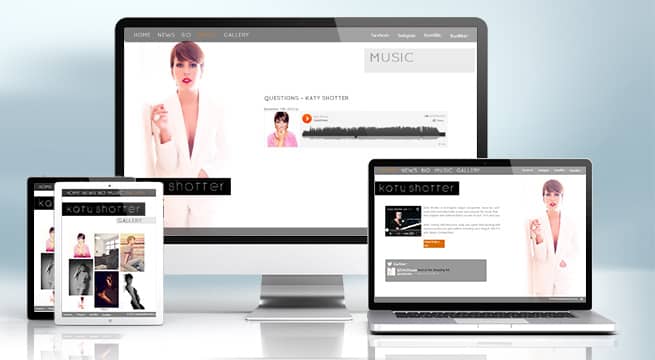
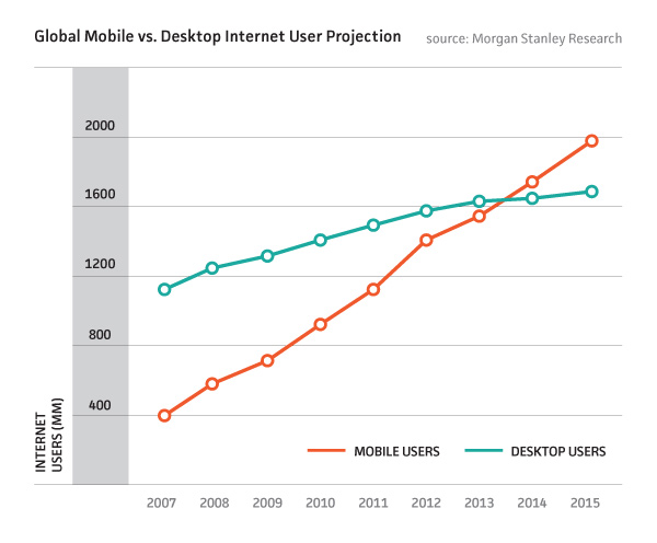
While it’s apparent that the web is increasingly accessed by phones and tablets on the move and on the sofa, many websites are yet to be updated to respond to this and the result can be very frustrating for the customer.
Websites with drop down menus that don’t work on iPad, booking forms that simply break on mobile phones and newsletter popups that render sites inaccessible once popped to anything but PC’s and laptops are still amazingly commonplace even on the most highly visited websites.

This is an opportunity! This is a chance to outmanoeuvre your competition to provide a site responsive to all who visit. If it’s easier to browse, book or buy on your website by mobile or tablet, visitors will prefer your site over the competition.
Responsive design can offer different content, depending on what device your customer is visiting your site with and how much bandwidth they have.
Your website can offer a rich media experience to desktop PC browsers while still providing a fast experience to mobile browsers with a slower connection to the internet.
It’s also possible that your business attracts more mobile customers than any other medium – if you already have a website you can easily check this using your google analytics account:

A wedding car hire company recently found that over 70% of their web traffic was coming from mobile and tablet search.
This makes a lot of sense – many soon to be wed couples are in an age range that embraces new technology and often will have the latest smartphone or tablet.
Furthermore it’s quite likely they will be:
There are lots of different size mobiles and tablets out there – how many designs do I need?
There are many other reasons to ensure your site is responsive
With Android and Google glass – Google loves the mobile web and is taking every step towards providing a more mobile experience.
The latest Hummingbird update is just the beginning as Google now tailors its services to mobile web users with voice search and location aware indexing.
Google will prioritise websites optimised for mobile search, and while design will not affect SEO, there is no point in increased traffic if it doesn’t convert to sales!
Some more examples of Mobile Web Design
Home DIY and decorating businesses could provide better mobile browsing for workmen on site.
Restaurants could ensure booking forms and availability information were readily available and working for mobile users nearby.
Venues could provide mobile friendly gig listings for customers who are already out and looking where to go next.
What about your business? What could a mobile friendly website do for you?
Hey Wait! Before you go why not download our 6 Fundamentals for Website Success PDF?
It's a great resource to ensure your site is performing in tip top condition!

With a special focus on e-commerce, web development, and UX/UI design, we are the go-to choice for businesses not only in Newcastle and the North East but also throughout the UK.
Located in Gateshead, Baltic Design is at the forefront of the digital landscape, offering expert troubleshooting, speed optimisation, and robust hosting solutions.